VISUAL IDENTITY, ART DIRECTION & DESIGN
Founded in 2014, GoGuardian empowers schools and districts with EdTech solutions that enhance online safety and foster student engagement. In 2024, our creative team embarked on a brand refresh to unify our brand expression and create an identity that feels warm, human, and reflective of the joy of classrooms.
Creative Direction: James King
Art Direction, Design: Remy Usman, Katie Krull
Turn up learning with GoGuardian
Founded in 2014, GoGuardian empowers schools and districts with EdTech solutions that enhance online safety and foster student engagement. In 2024, our creative team embarked on a brand refresh to unify our brand expression and create an identity that feels warm, human, and reflective of the joy of classrooms.
Creative Direction: James King
Art Direction, Design: Remy Usman, Katie Krull

PREVIOUS IDENTITY
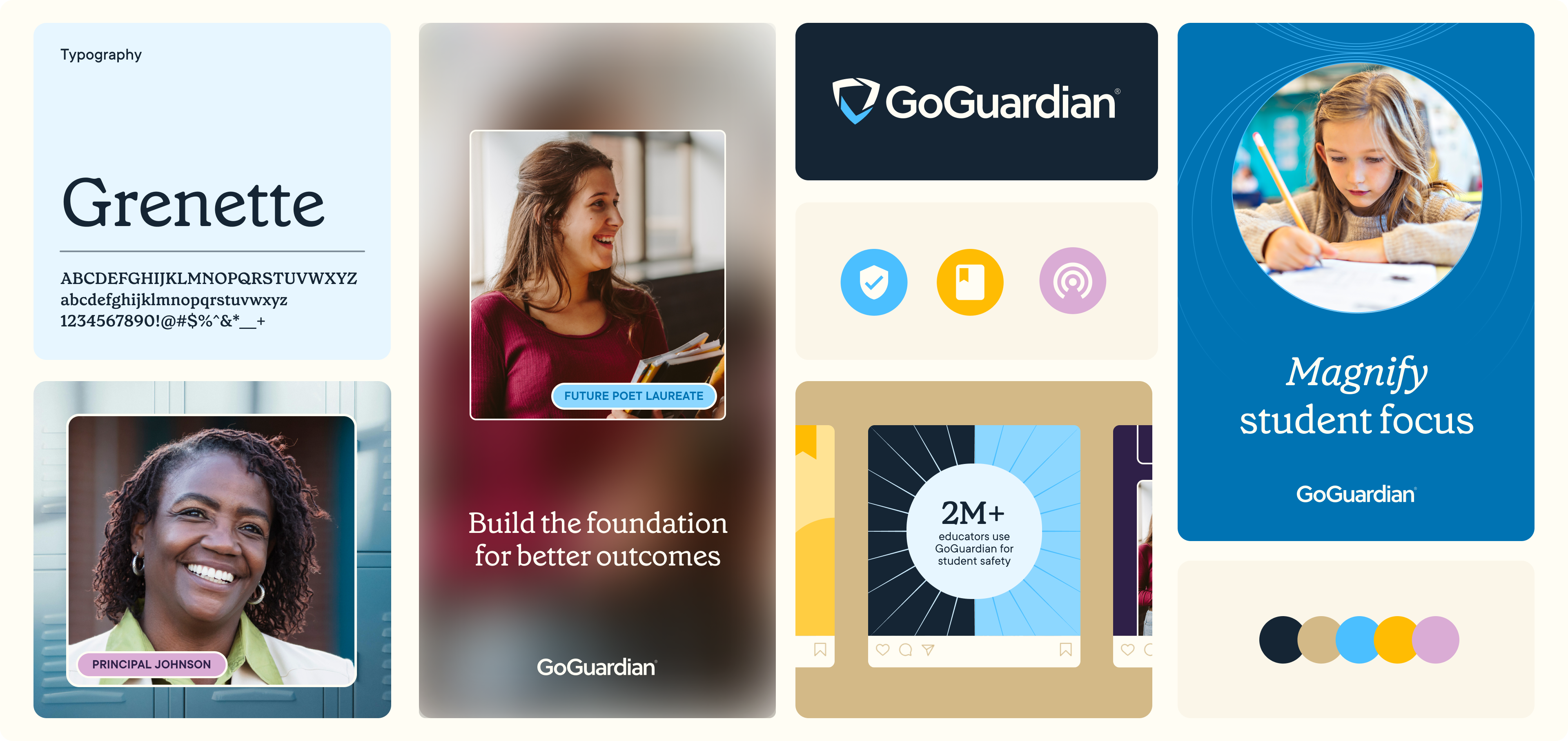
Years of growth through acquisitions and product expansion left GoGuardian’s visual identity fragmented and inconsistent. Clashing sub-brand palettes, outdated illustrations, and impersonal cool tones diluted its personality and failed to reflect the educators and administrators it serves. Core products like Teacher™, Admin™, and Beacon™ often blurred together, overshadowing the parent brand.
We began with a comprehensive design audit, identifying opportunities for differentiation while preserving essential elements of the original brand.

THE REFRESH
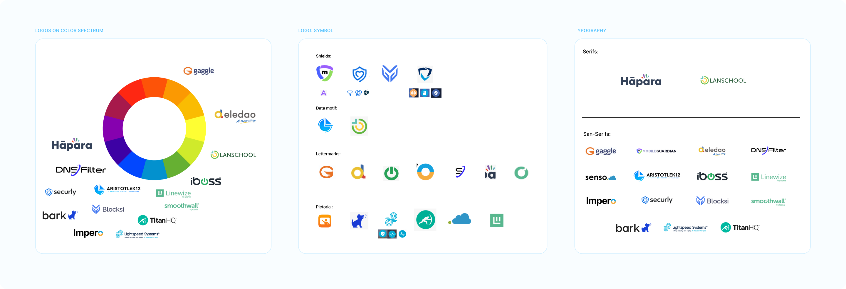
Insights from this competitive analysis informed updates to the brand palette; we brightened our core navy and introduced warm khakis, yellows, and calming lilacs—distancing ourselves from the industry’s overused “tech blue.” Distinct palettes for each product balanced individuality with cohesion under the GoGuardian parent brand.
While we initially recommended the serif typeface Grenette — as seen throughout this page — we ultimately selected New Spirit for the display font. Subject-focused photography replaced vector illustrations, capturing real school settings, bright lighting, and diverse individuals. Together, these updates created a vibrant, energetic identity that champions educators and administrators.


KEY GRAPHIC + PHOTO TREATMENTS
We felt it essential that our imagery reflect real classrooms and scholastic settings where our users operate. To overcome stock photography limitations, we developed layered treatments that strategically frame and position subjects. Delicate linework and motifs like starbursts, grids, and radiating shapes complement the photography, adding depth and texture.
We felt it essential that our imagery reflect real classrooms and scholastic settings where our users operate. To overcome stock photography limitations, we developed layered treatments that strategically frame and position subjects. Delicate linework and motifs like starbursts, grids, and radiating shapes complement the photography, adding depth and texture.


WEBPAGES
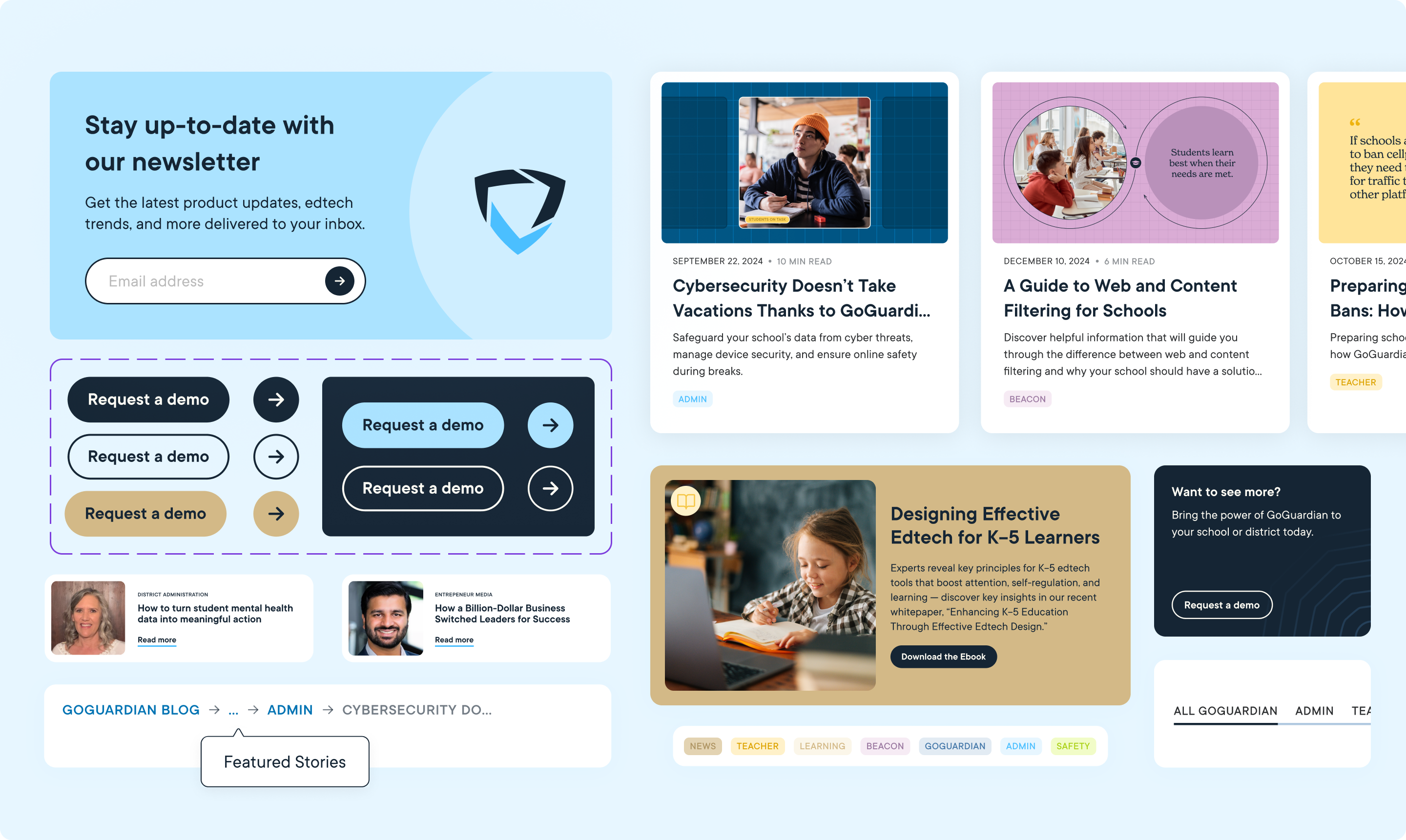
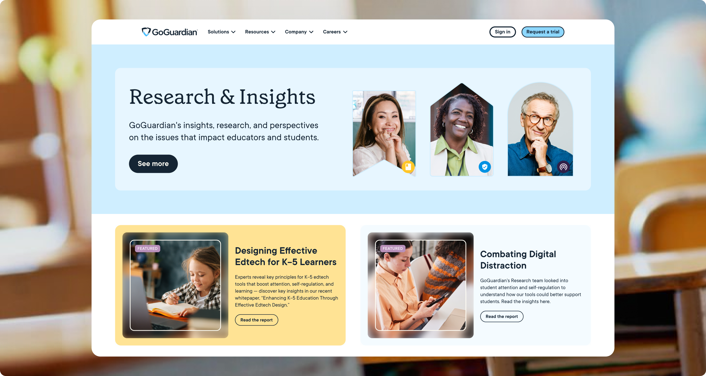
I led the website redesign for this refresh, establishing a cohesive design system for UI elements such as buttons, links, typography, and featured content. For pages outside my direct design scope, I provided art direction, crafting medium-fidelity layouts and defining new components to enhance functionality. My focus centered on improving user experience through simplified interactions, responsive design, and intuitive navigation.
I led the website redesign for this refresh, establishing a cohesive design system for UI elements such as buttons, links, typography, and featured content. For pages outside my direct design scope, I provided art direction, crafting medium-fidelity layouts and defining new components to enhance functionality. My focus centered on improving user experience through simplified interactions, responsive design, and intuitive navigation.


CUSTOMER SUCCESS
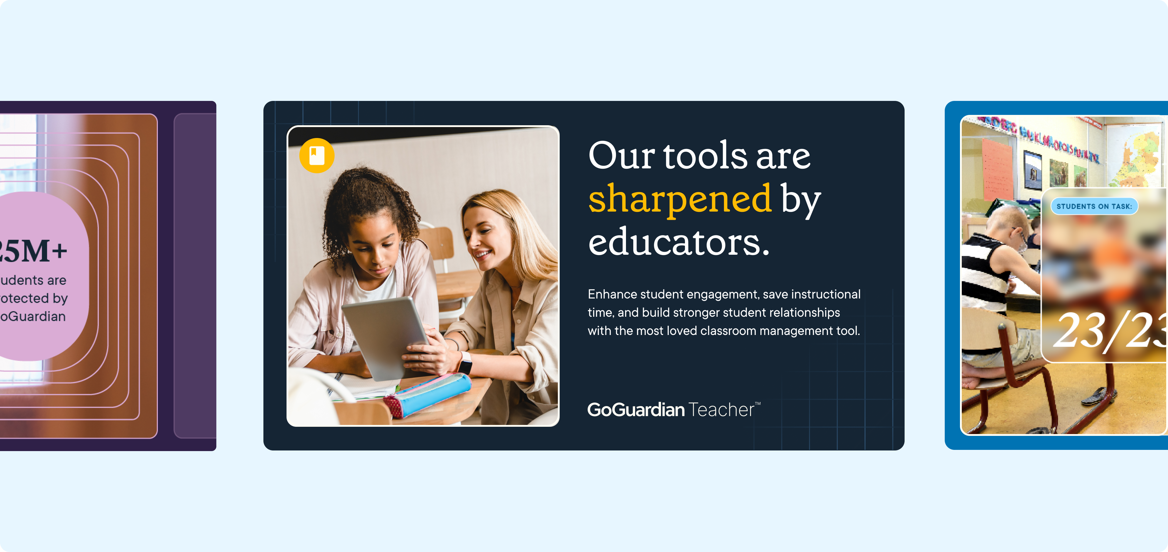
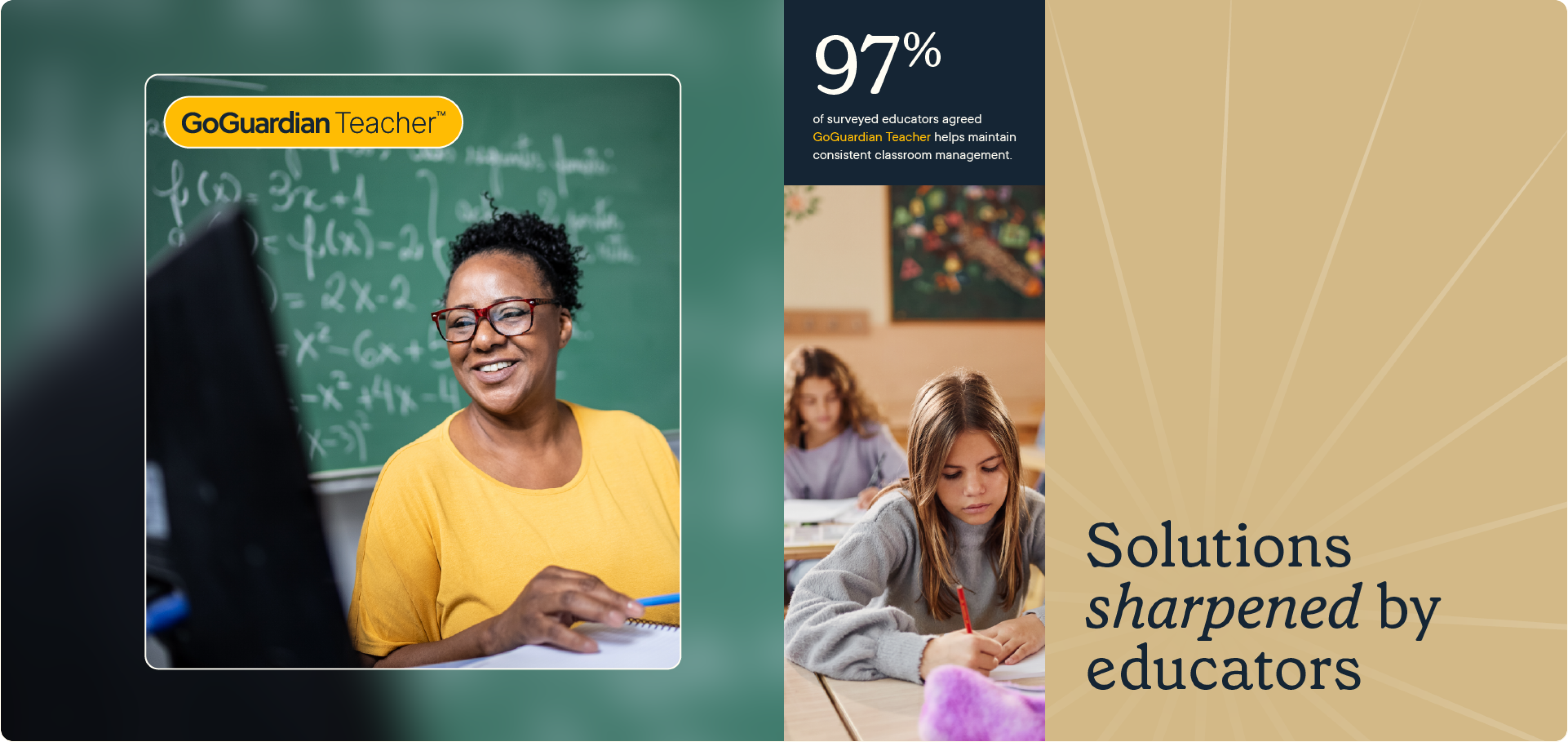
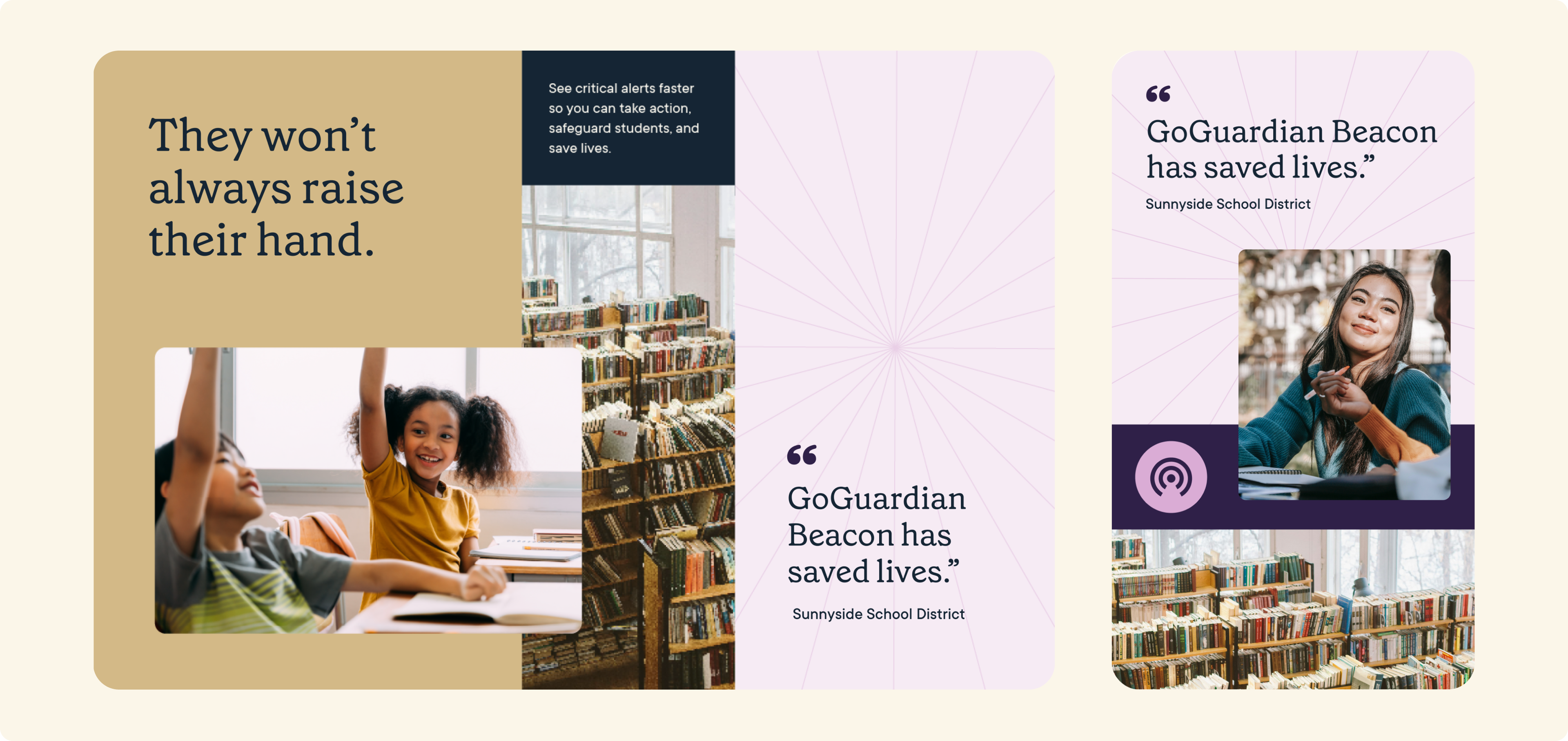
A renewed focus on customer success stories shaped much of the refresh. We introduced a tri-grid system that expands our layered photo treatments, enhancing our storytelling at a glance.
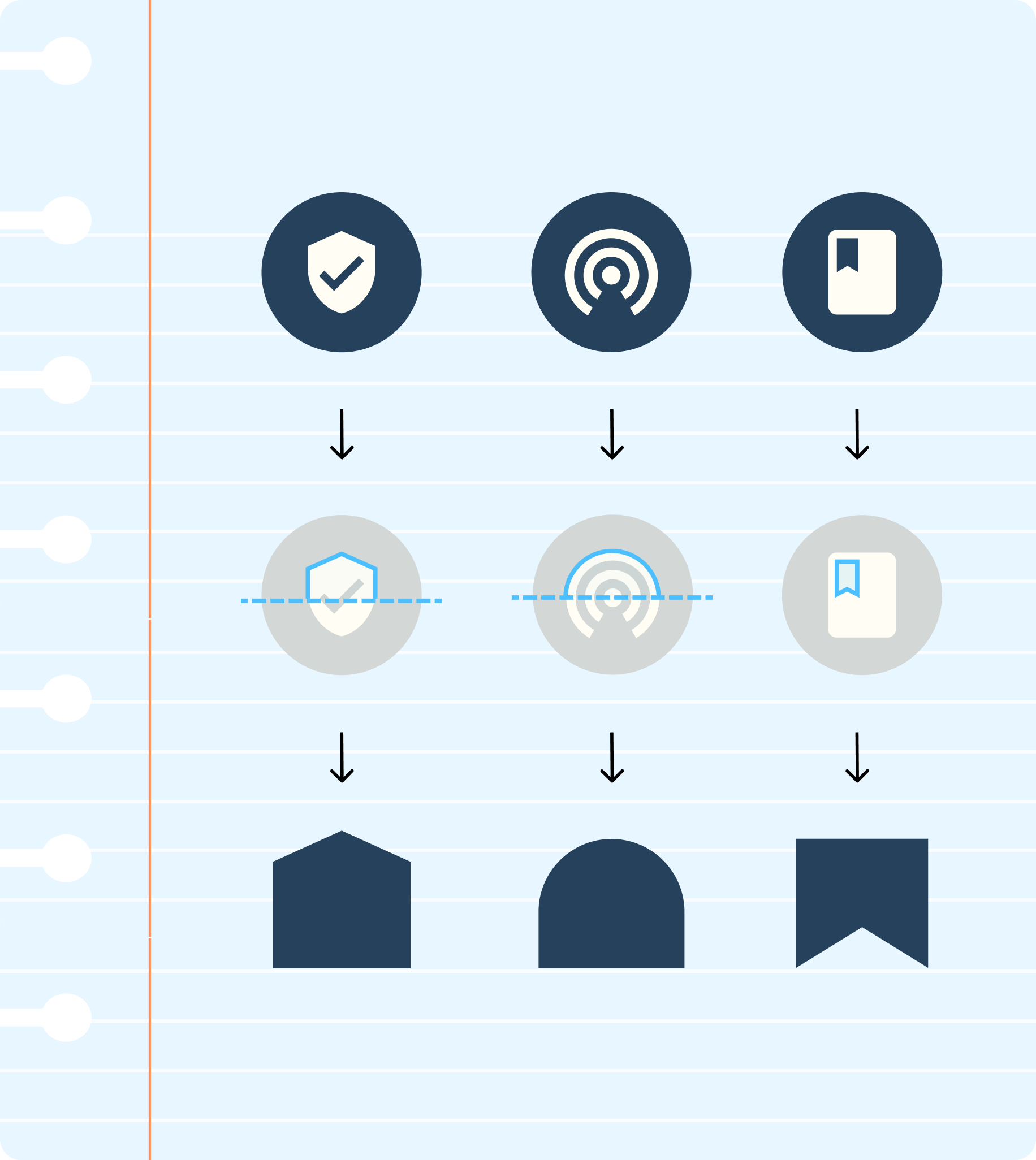
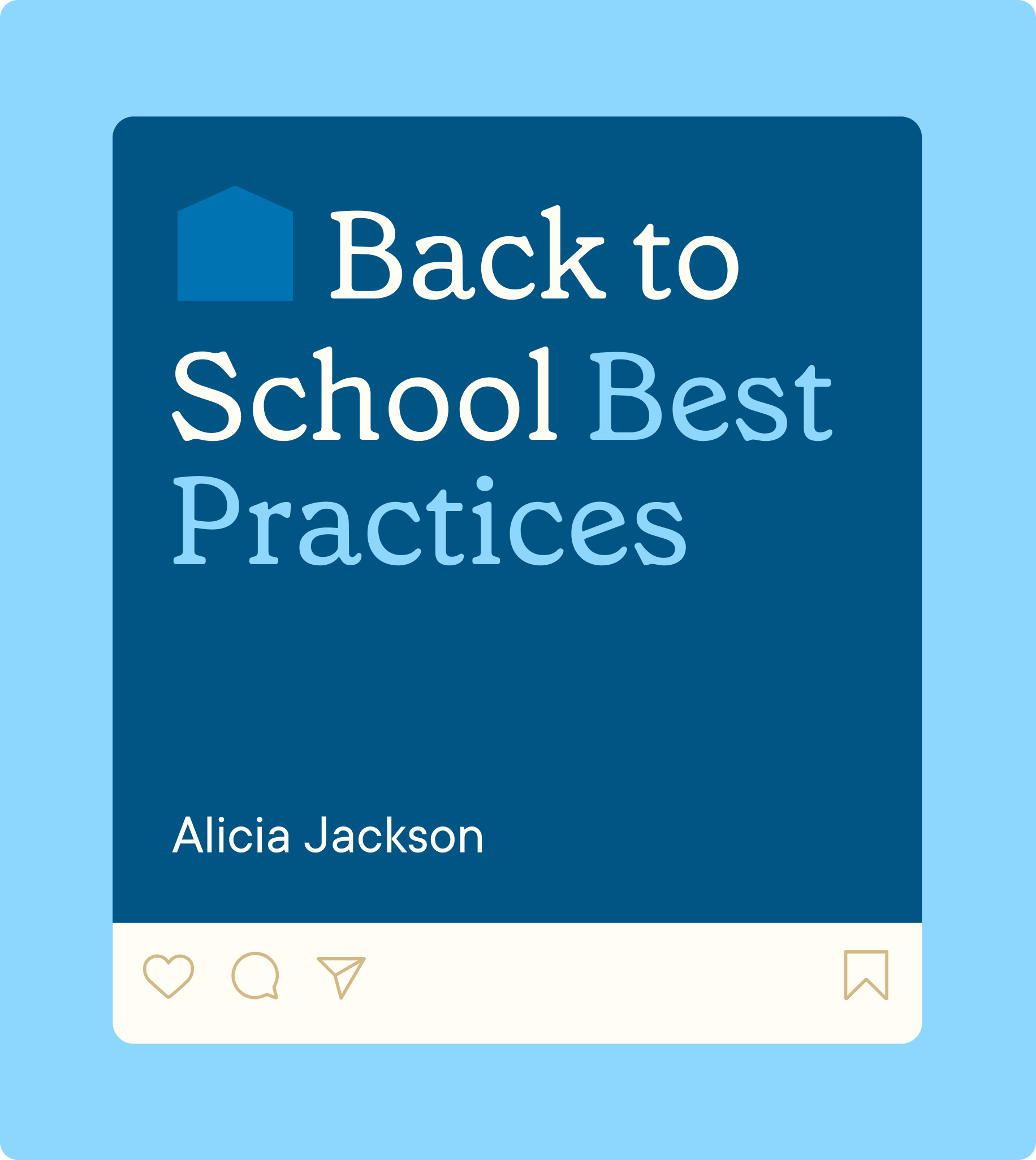
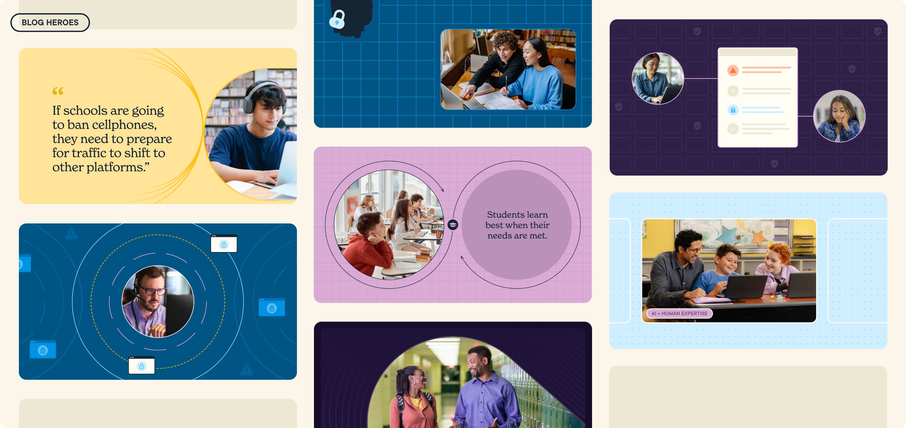
Initially created to showcase customer success stories, these treatments extend seamlessly across the system, enriching webpage heroes and print collateral. Motifs distilled from product icons add dynamic accents to materials like blog headers and social cards.



EVENTS & SWAG
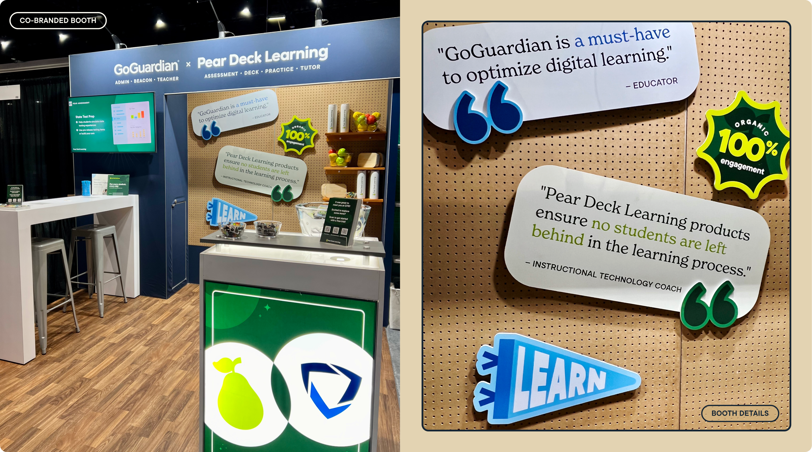
Our event materials and swag bring the refreshed brand to life in physical spaces, allowing for a more personable expression. Often co-branded with the more playful Pear Deck Learning, these designs balance aesthetics, connecting meaningfully with audiences while celebrating the educators and administrators at the heart of our mission.
Our event materials and swag bring the refreshed brand to life in physical spaces, allowing for a more personable expression. Often co-branded with the more playful Pear Deck Learning, these designs balance aesthetics, connecting meaningfully with audiences while celebrating the educators and administrators at the heart of our mission.
